My impact
Research findings translated into a handbook and design directions ICICI could act on immediately.
Understanding the brief
Context
As of 2022, 81% of the UPI market had Google Pay, PhonePe and PayTM users.
71% of ICICI customers didn’t do UPI payments from the bank app, but used it for other tasks.
ICICI approached our team to find out why, and how to bring traction to their UPI.
So we conducted an in-depth research to solve this issue.
The Objective
To curate a research handbook that addressed the following challenges:
How do you make ICICI UPI stand out without a first mover advantage?
How do we make ICICI UPI be so reliable that users deem it more reliable than their current UPI platforms?
How and what scenarios do we test to identify the correct problems and insights?
What design directions can ICICI take after this research?
Overheard while we researched
- “Gpay kar do”
- “scanner hai?”
- “Paytm par Rs. 200..”
The Research Plan
The research was structured from a broad to a narrow spectrum using a funnel method. 24 users across 5 tier-1 cities in India were interviewed.
Funnel method research. Prototyped and tested 5 existing scenario based flows.
24 users, across 5 tier-1 cities in India.
Curated research insights, spotting patterns.
Designed a handbook and design directions for ICICI Bank.
Five scenarios, tested
We prototyped five real-world UPI tasks and watched users attempt each one in iMobile Pay, with no hints.
Scenario 01 of 05
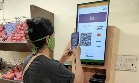
Scan & Pay at Subway
Design challenge #1
No first-mover advantage
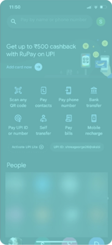
We had to address the “hard truth” that ICICI bank has no first-mover advantage against its competitors. So, to stand out as a UPI platform, they would have to innovate on the branding, marketing and offers cohorts.
Design challenge #2
Security concerns
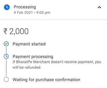
The environment impacts the user’s decision to open the right app.
Users resort to Gpay / Phonepe / PayTM for small payments because:
“They can see my balance also, so I dont open the app in public.”
“I wont open my banking app around many people they will see my password and snatch my phone.”
Design challenge #3
Labels
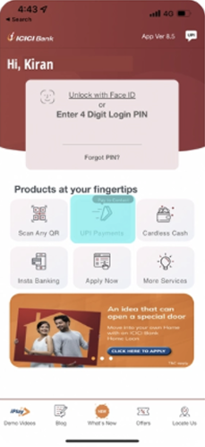
Users take more time to complete UPI payments on the app due to confusing labels.
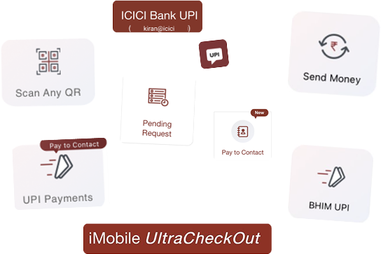
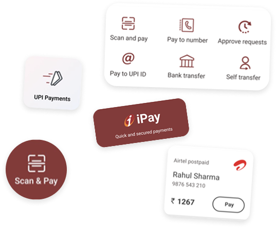
10 Factors that Drive UPI Preference & Usage
Low hanging fruit
Discoverability, Look & Feel, Labels and Form Design are the four ICICI could move on immediately.
Note: The full handbook goes much deeper, this case study highlights only the most striking findings from it.
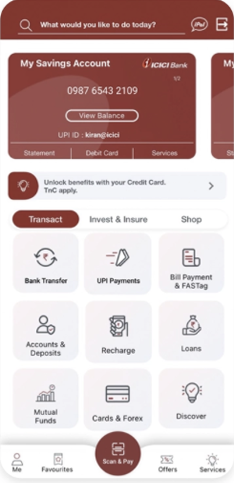
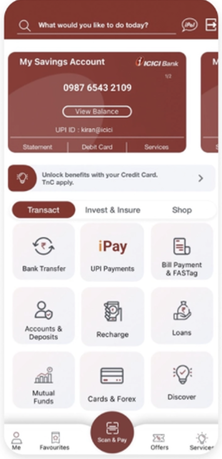
3 Design Directions
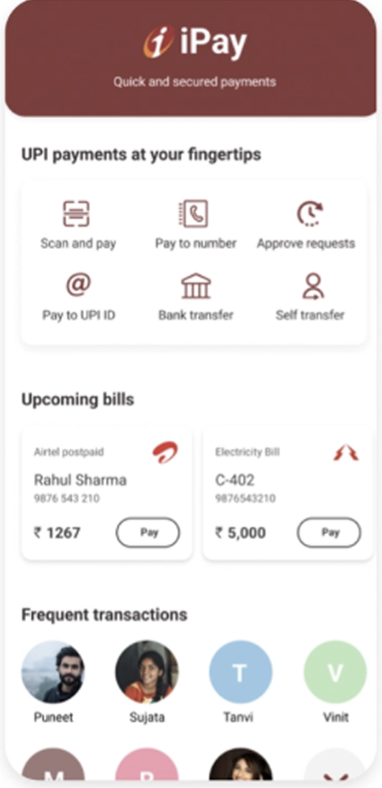
We suggested 3 different ways to highlight ICICI UPI to the user based on the amount of disruption.
Impact
24 interviews conducted across 5 cities to map real UPI trust gaps and usage drivers.
Four days from research handover to live product changes.
ICICI came back to the agency with 3 more projects after ours.